Gistory
Branding • Identity • Digital Design • Print Design • Web Design • Editorial Content • 2014
Gistory (pronounced with a soft g) was a journalism startup based out of the Reynolds Journalism Institute at the University of Missouri. We sought to put news “on the map” – literally.
Reporters around the world contributed news stories, which were edited down into complete, concise, contextual articles of 750 words or fewer, and displayed on our interactive world map.
I created the branding and identity design for Gistory, worked closely with developers to bring the unique site to life, collaborated with the social media team to produce engaging graphics, and created all of our print materials for conferences and events.

Site Design

Screenshot of the live Gistory site reporting of the ongoing push for Catalan independence from Spain. I designed the website and worked closely with the web development team to bring the site's unique functionality to life.
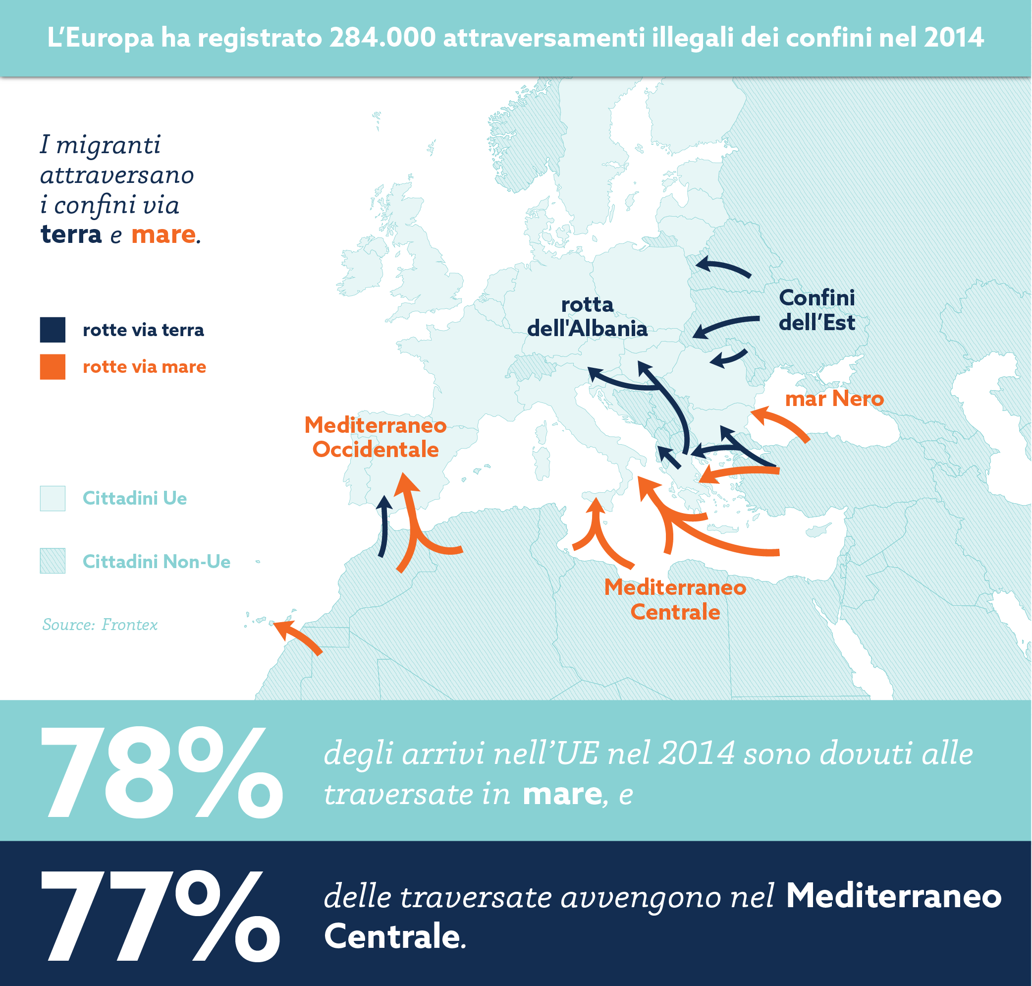
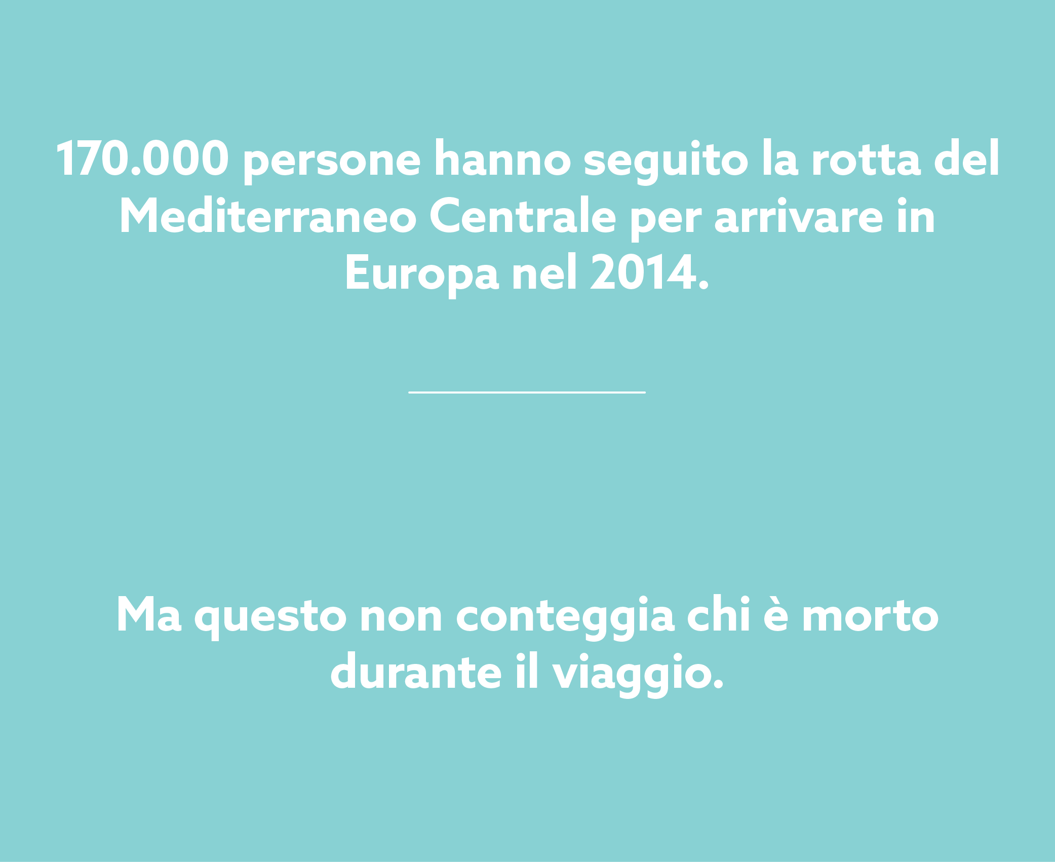
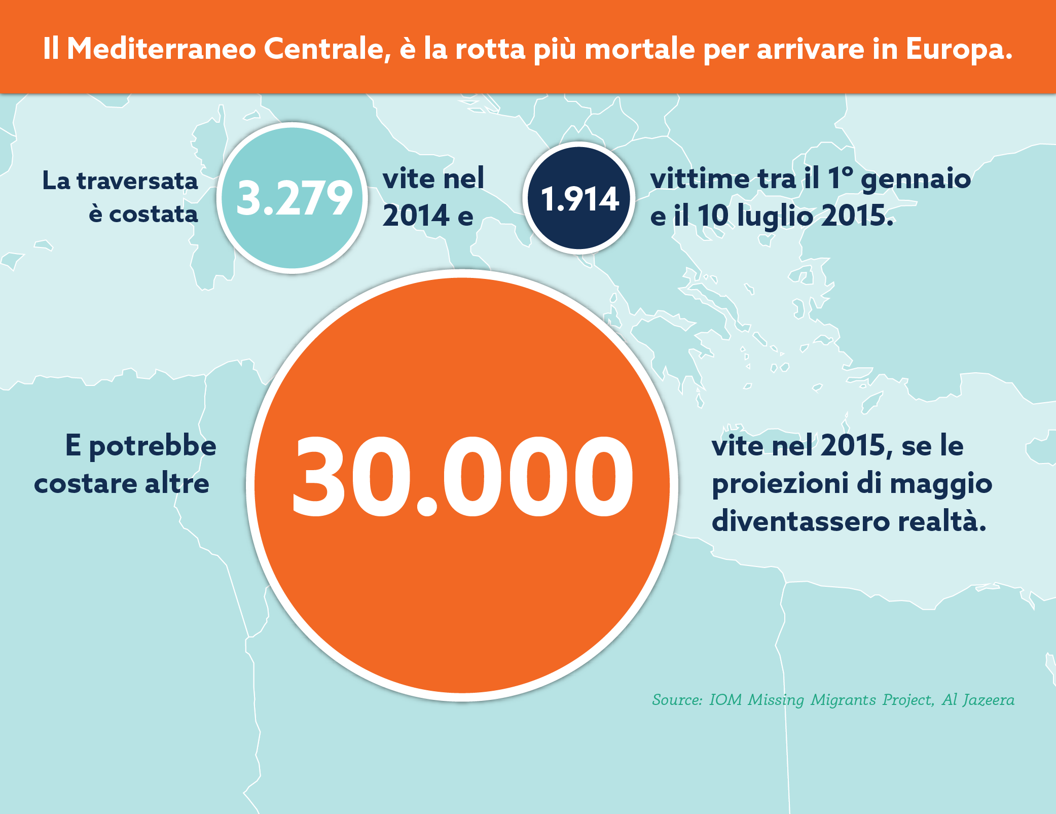
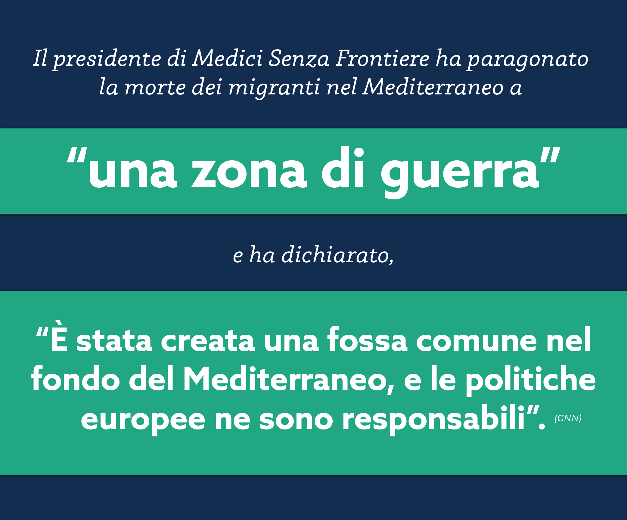
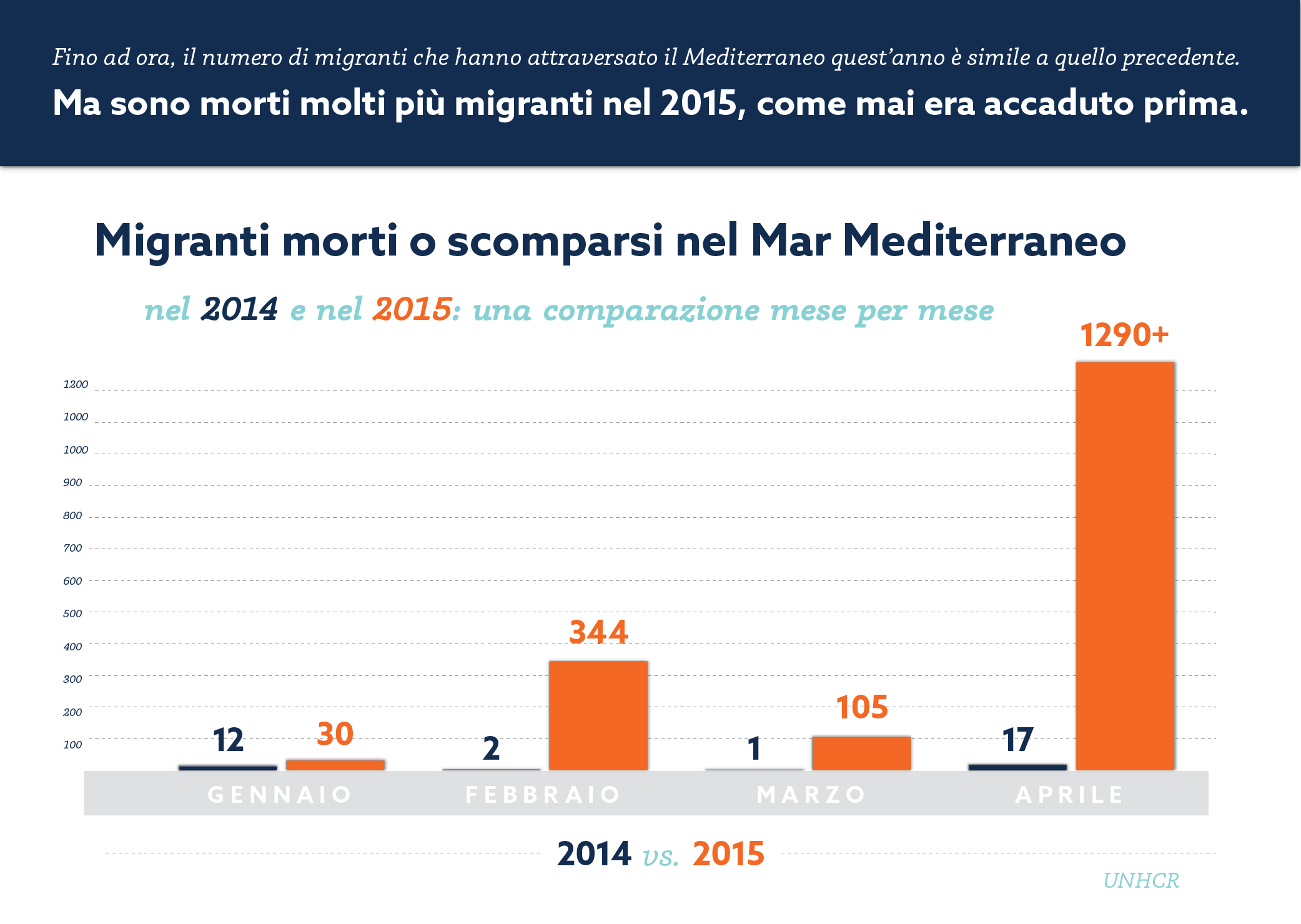
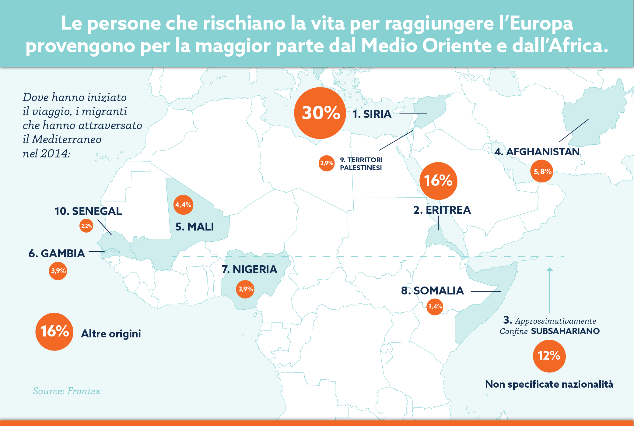
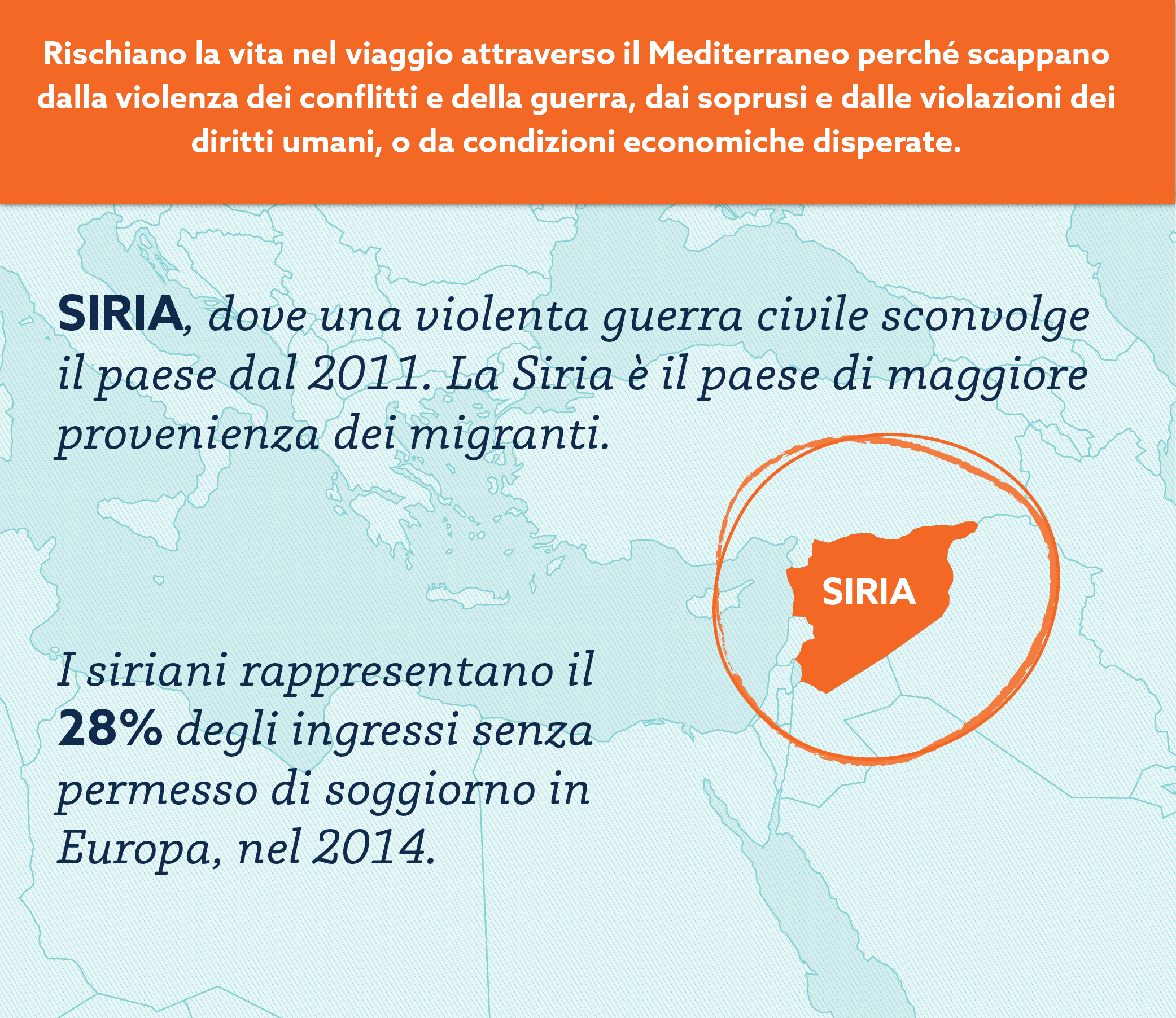
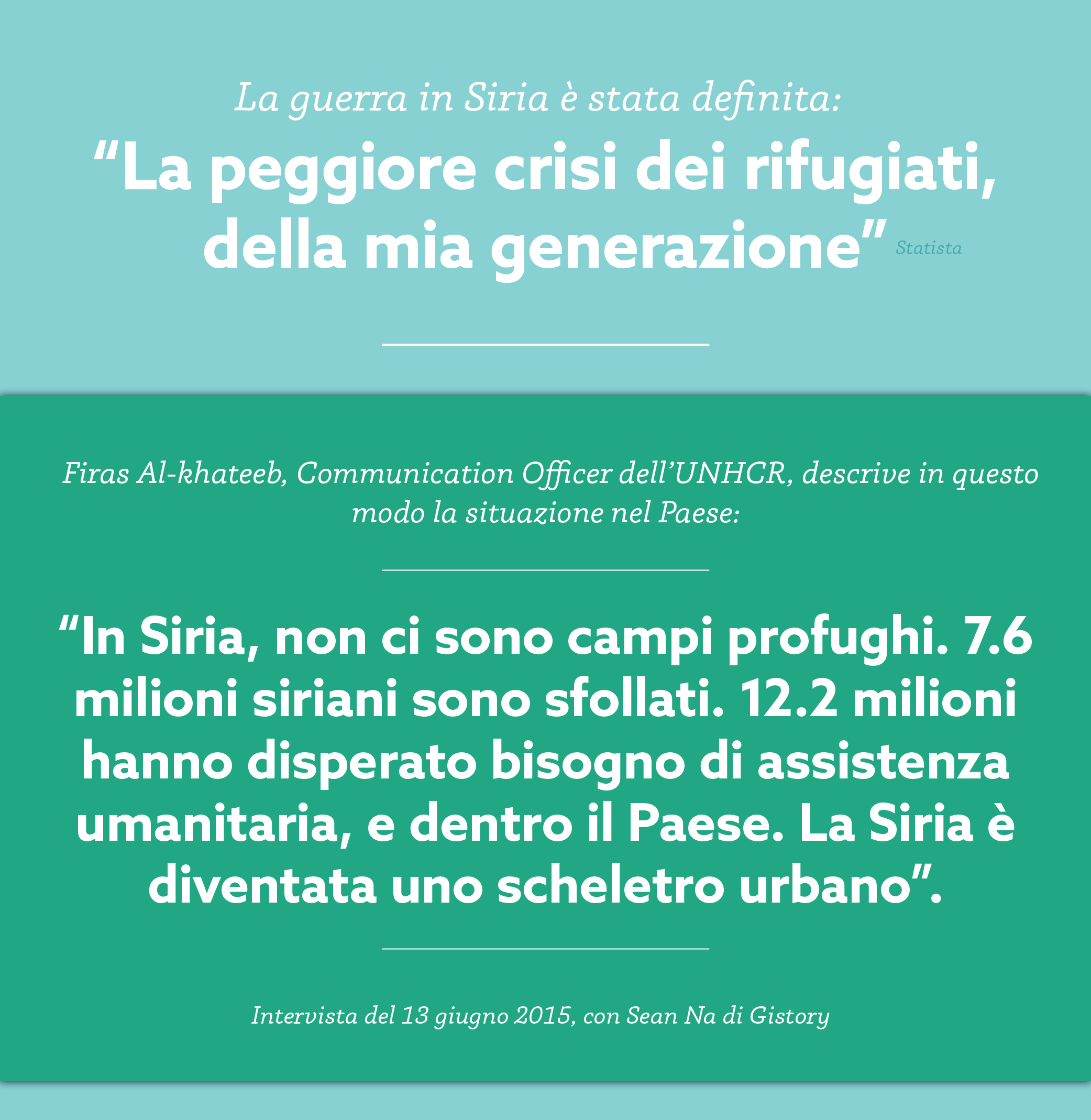
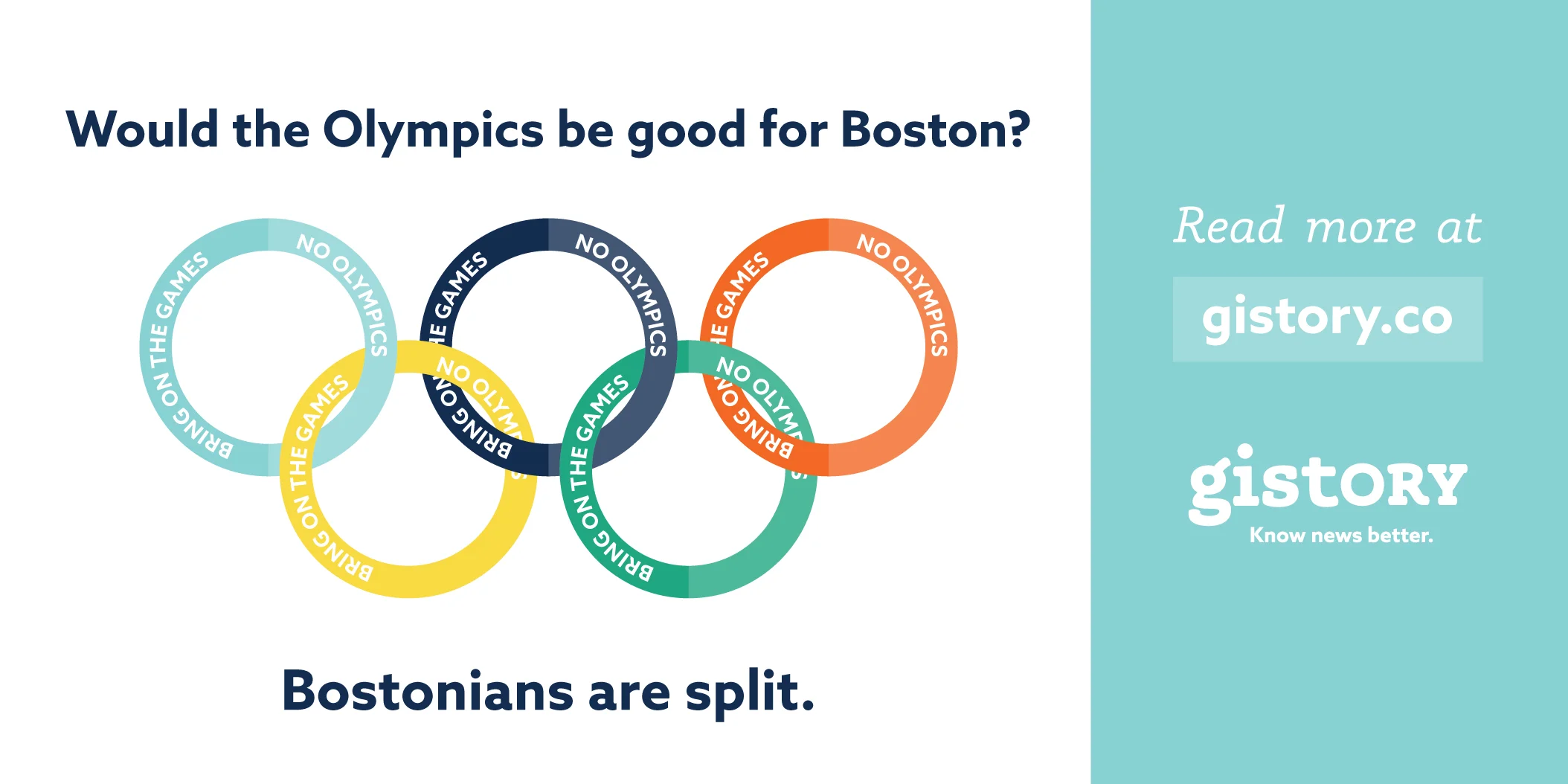
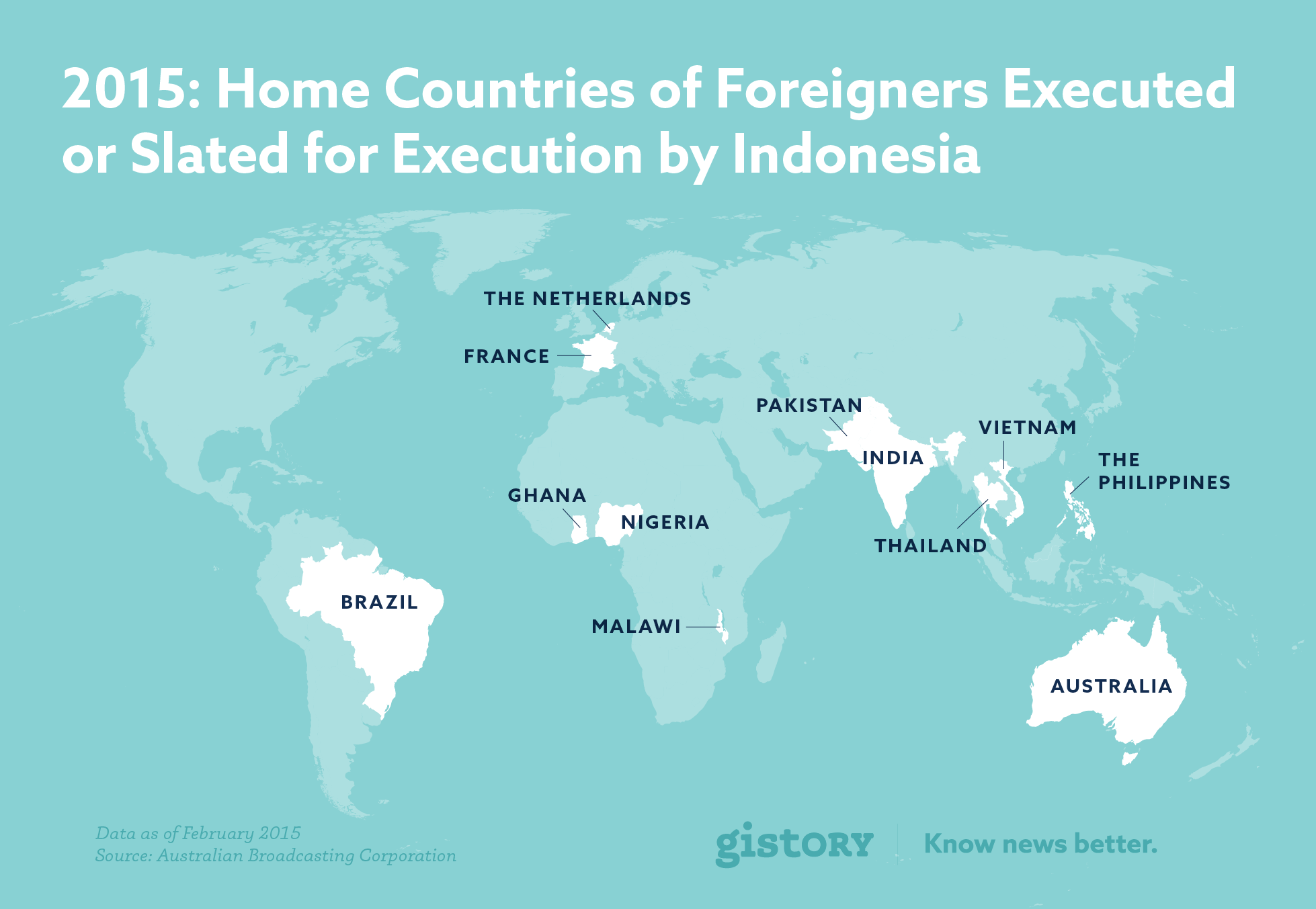
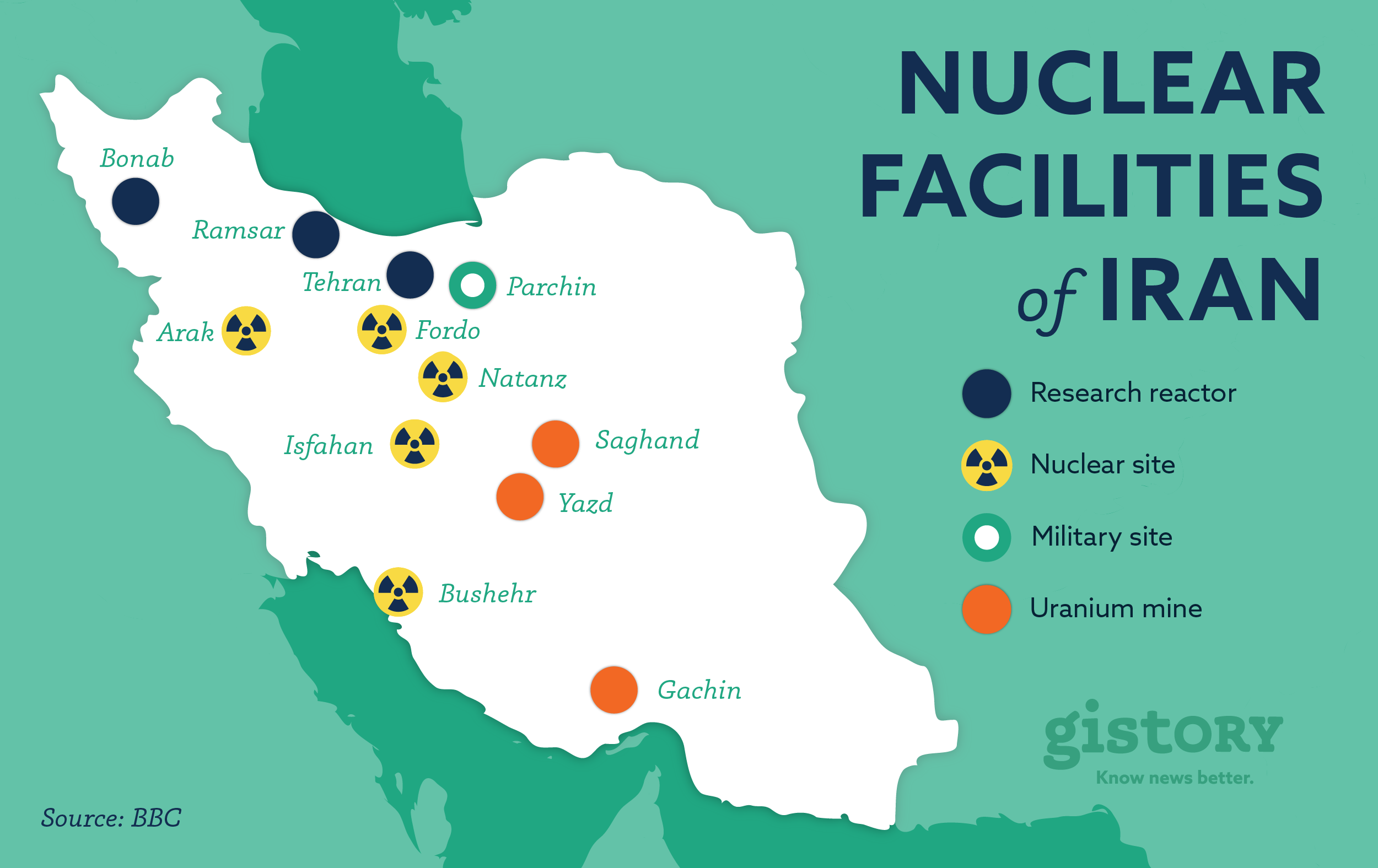
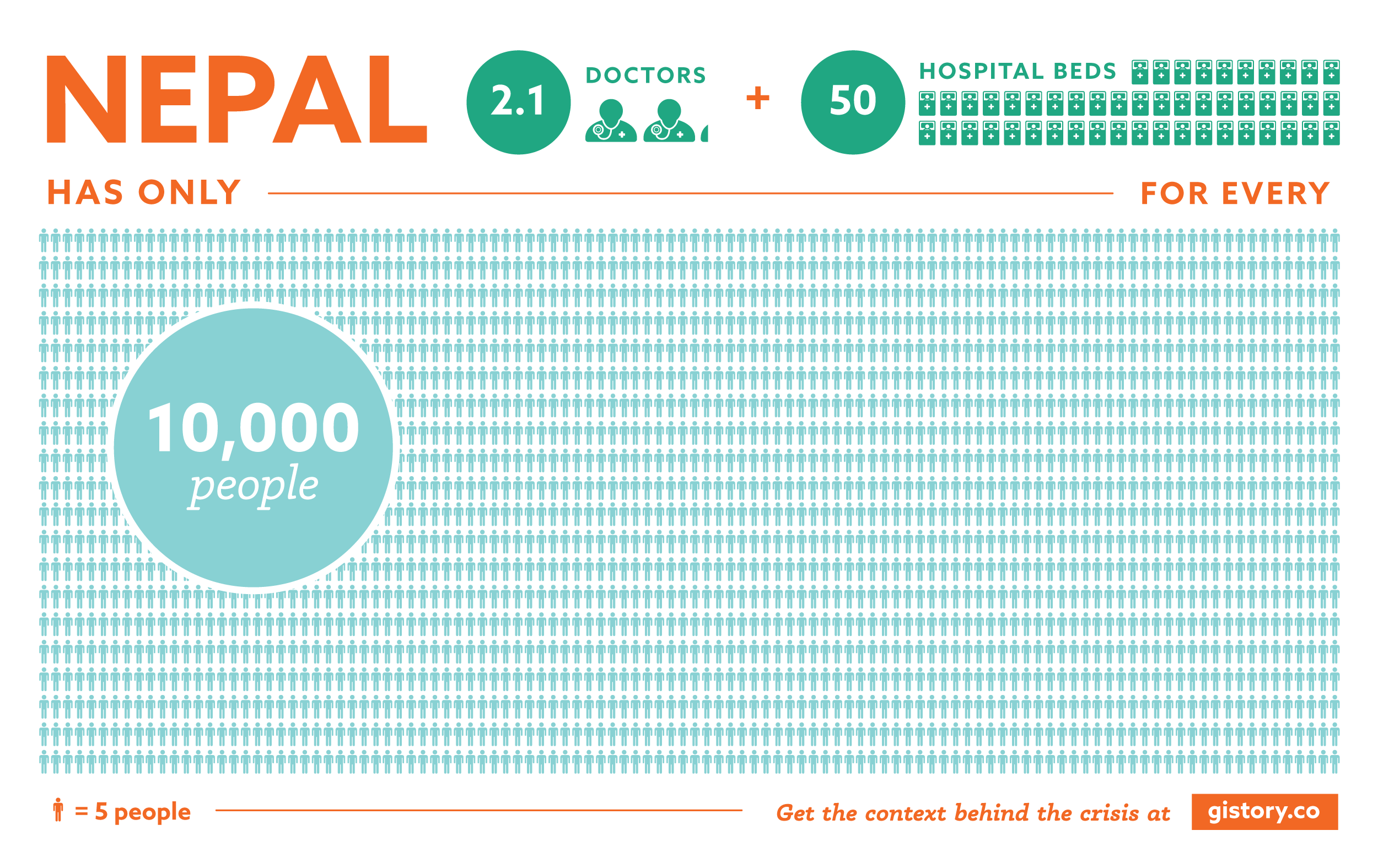
Selected Content Graphics and Infographics
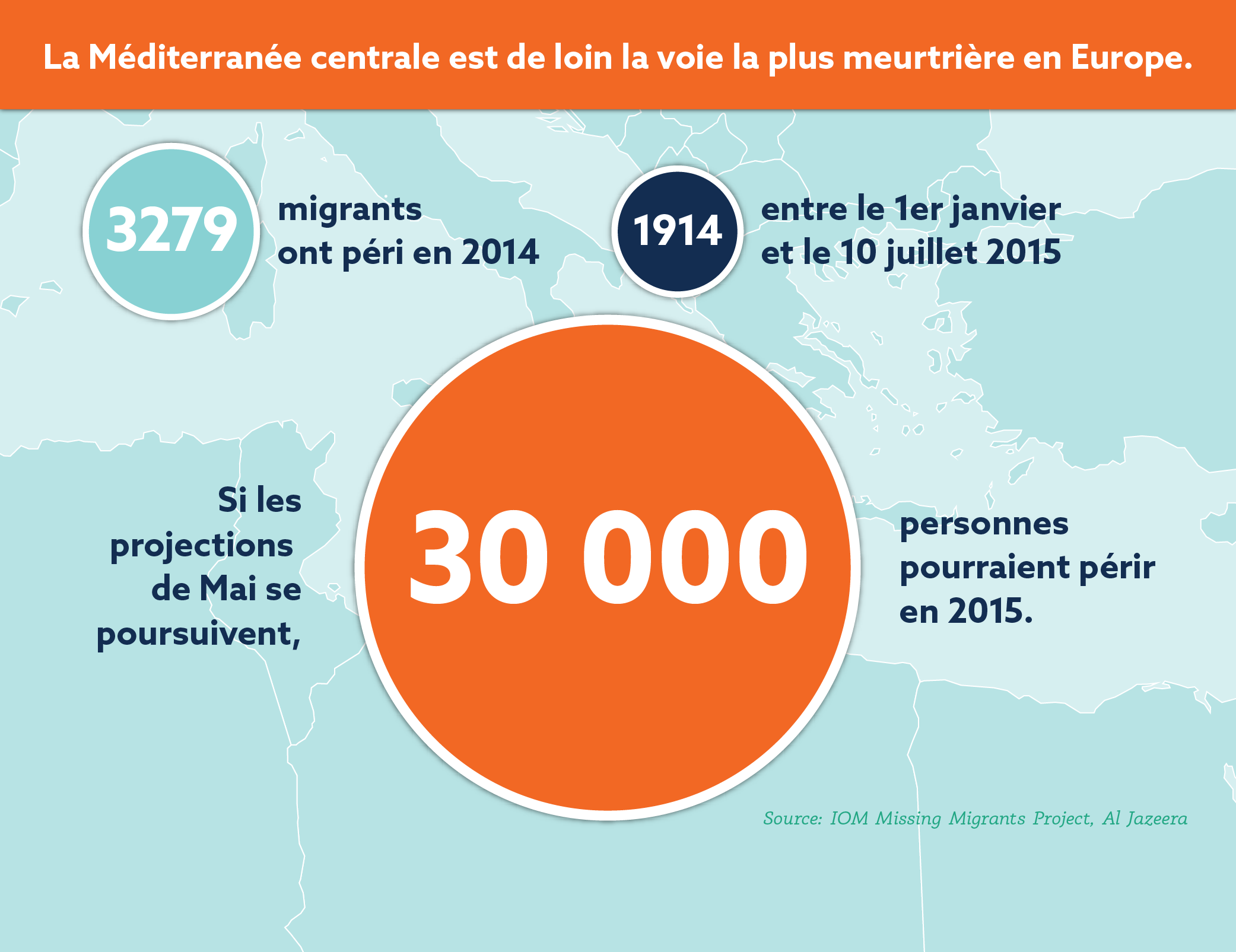
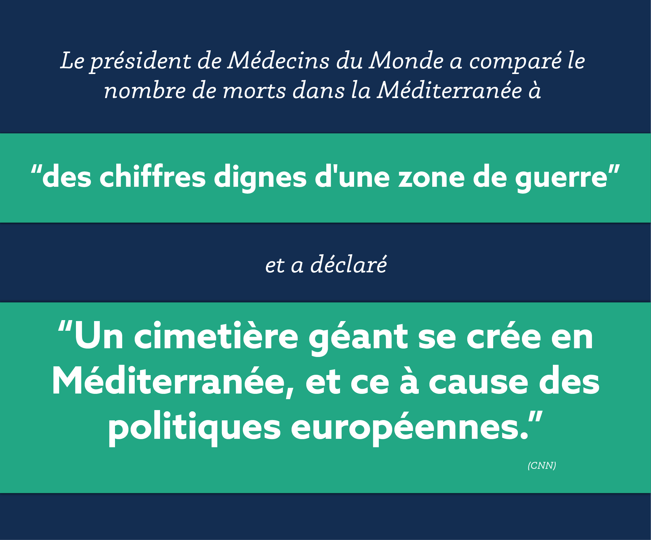
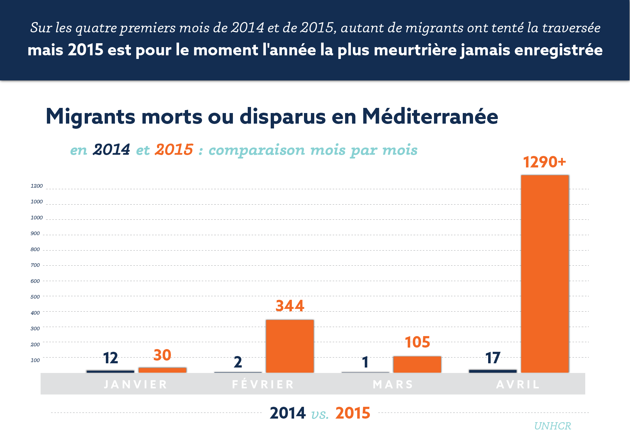
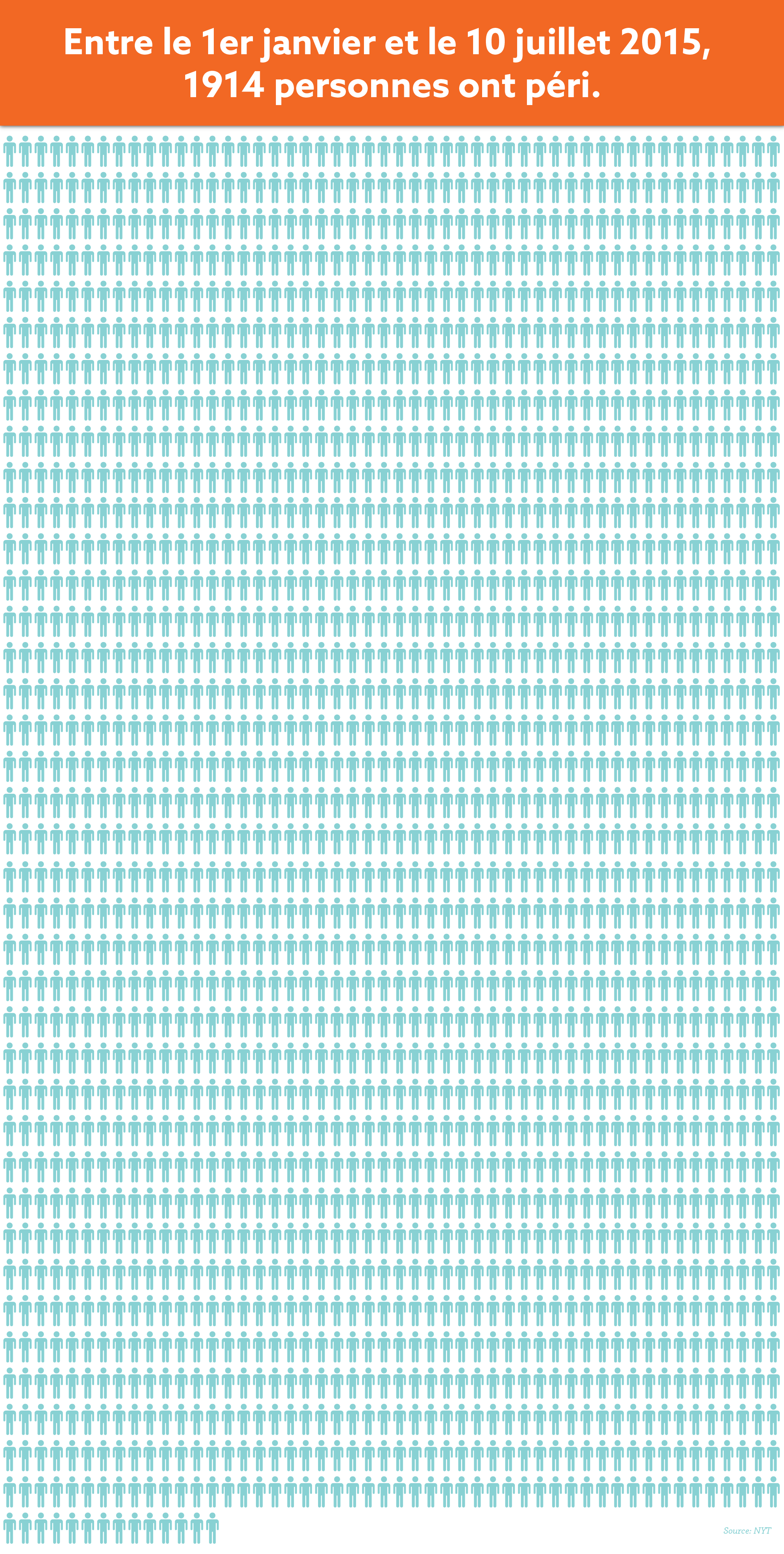
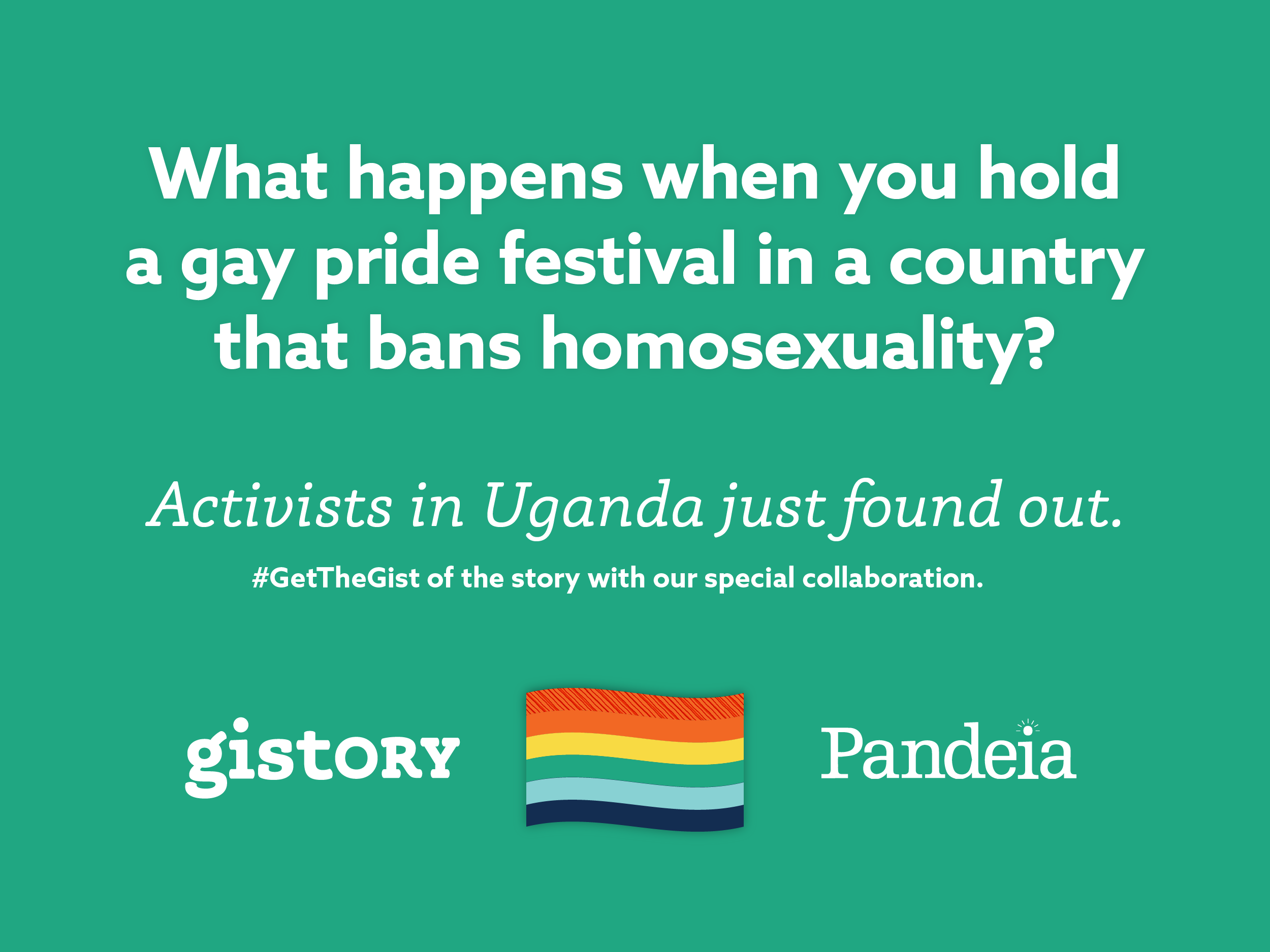
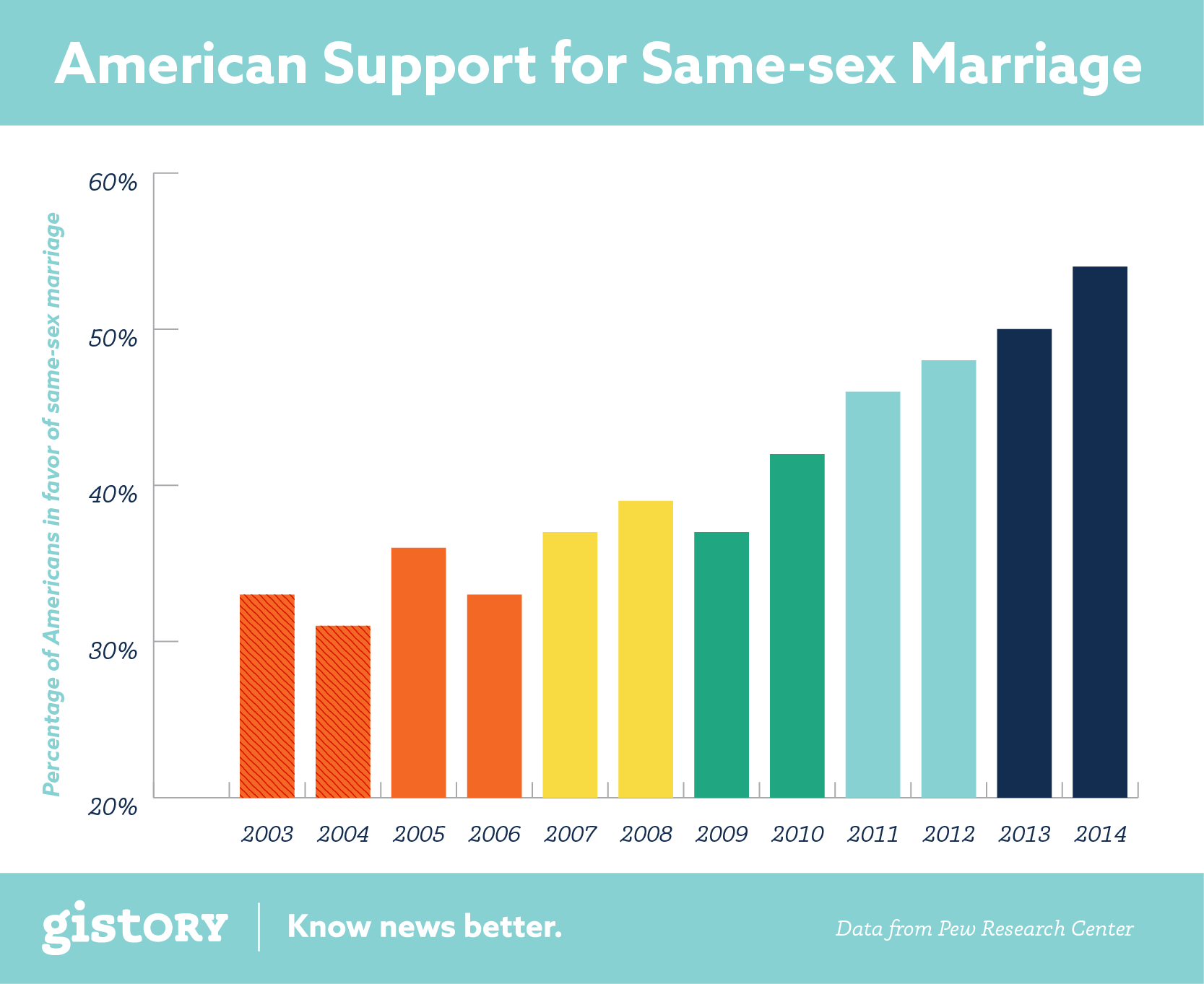
I created these editorial graphics for the Gistory news stories written by journalists and editors all over the world. These graphics debuted on Gistory's social media accounts, including Twitter, Instagram, Facebook, and Medium.
I was responsible for the visual design, visual execution, and selecting the content from each article that would best represent the story in a visual way. Integrating data-based content visualization, visual design, typography, editorial quotes, and cartography was both a challenge and a joy.
One special design consideration to note is the necessity of these graphics, especially those representing data and maps, to be colorblind-friendly. Switch your screen to grayscale viewing under your accessibility system options to view how I used contrast and color frequency to create data representations that perform with and without color.


Multilingual Visual Series
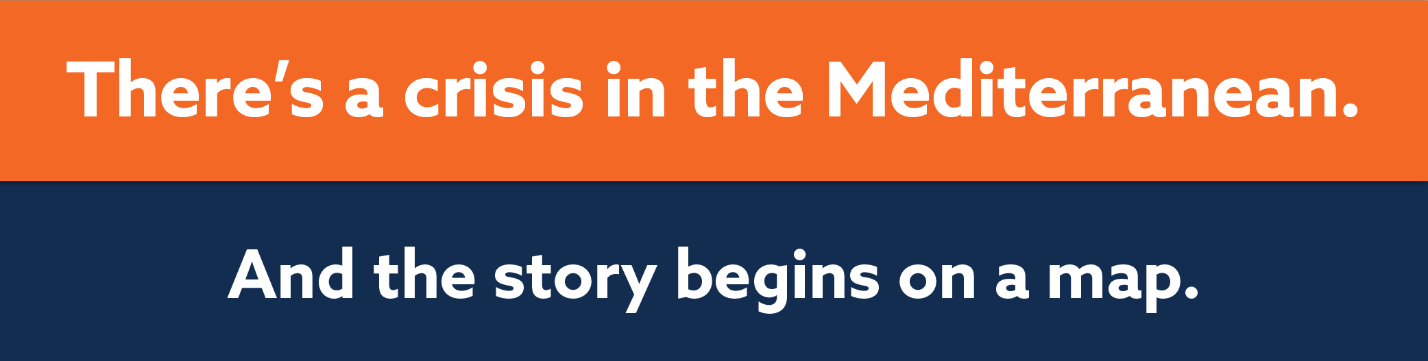
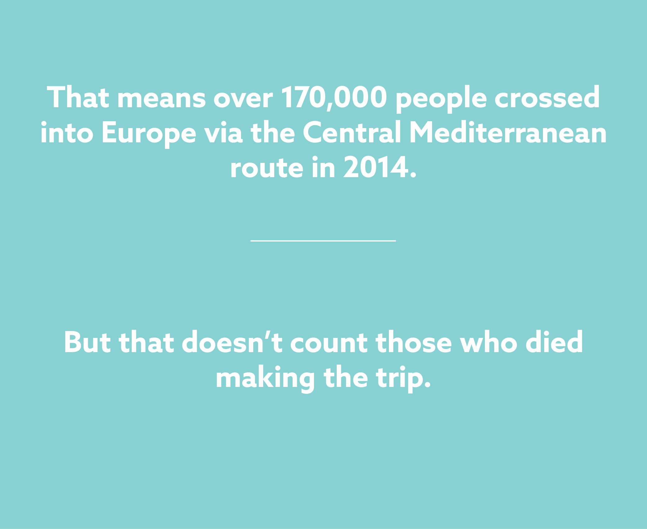
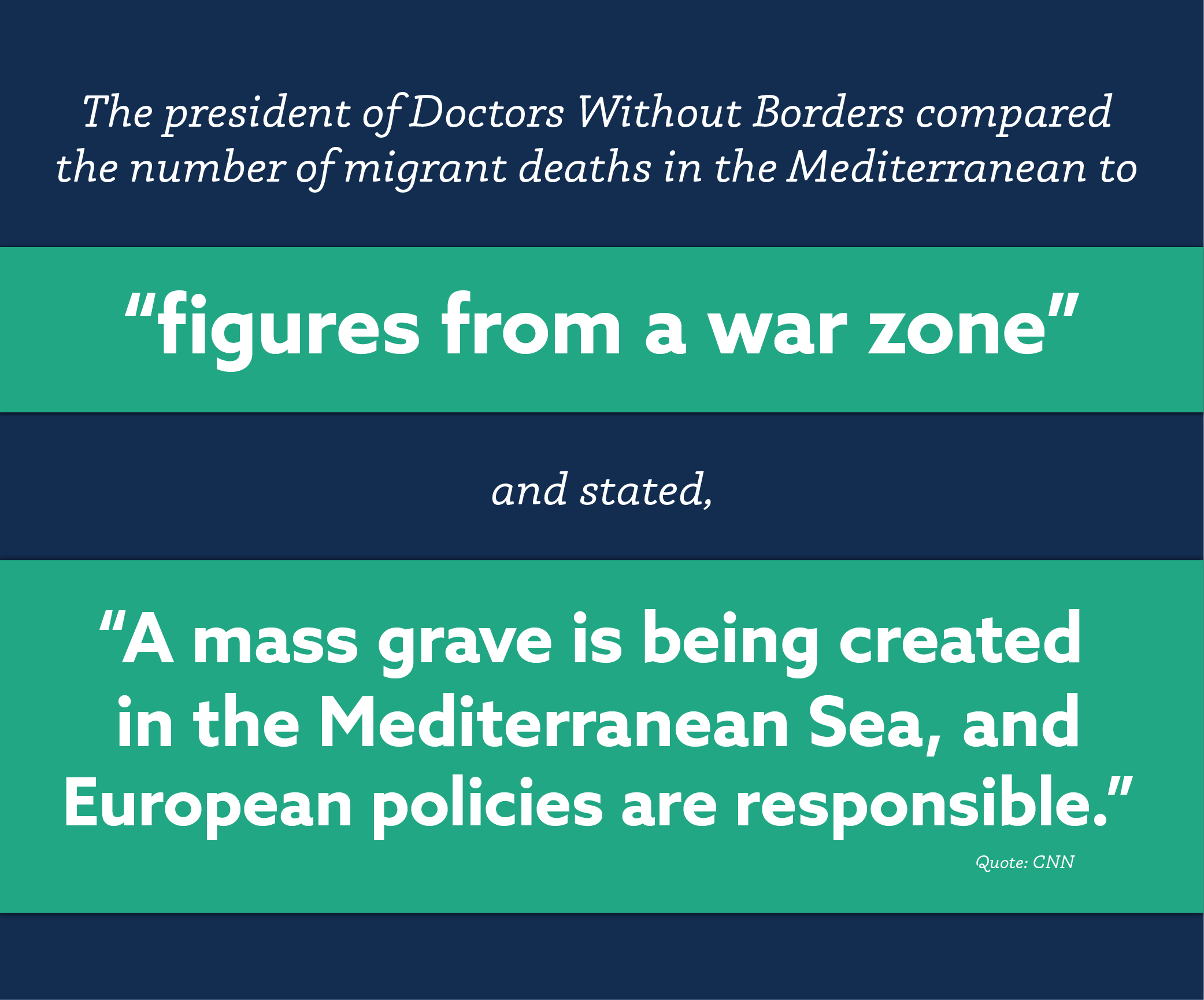
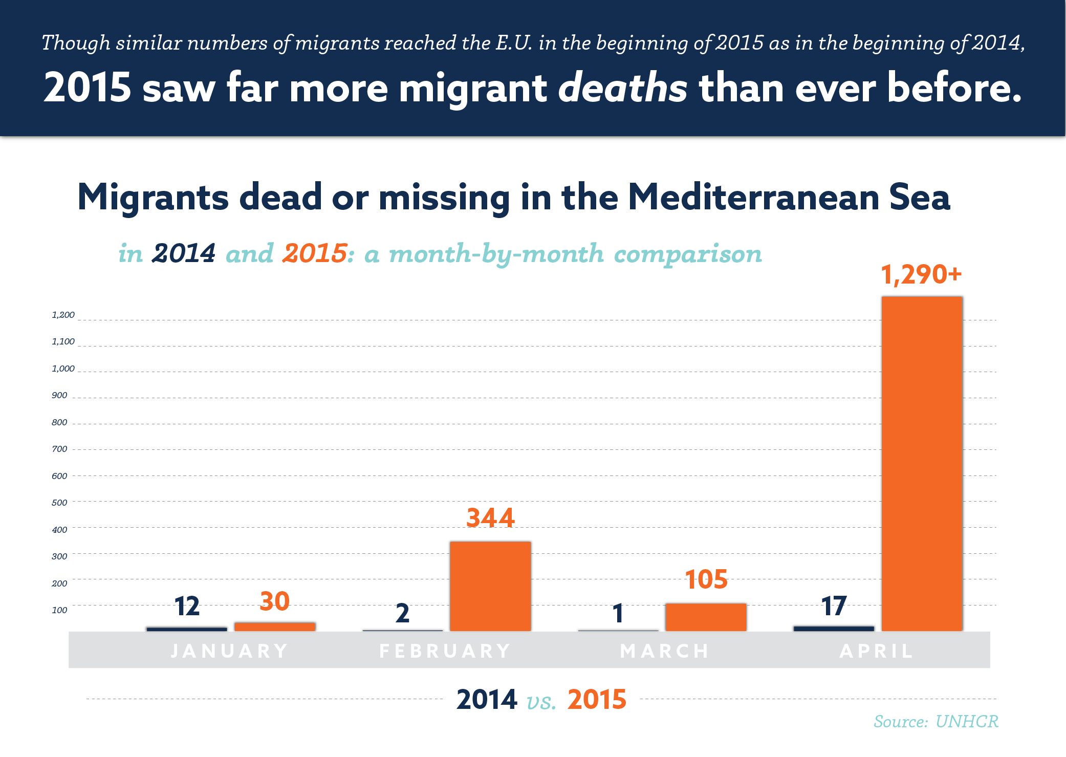
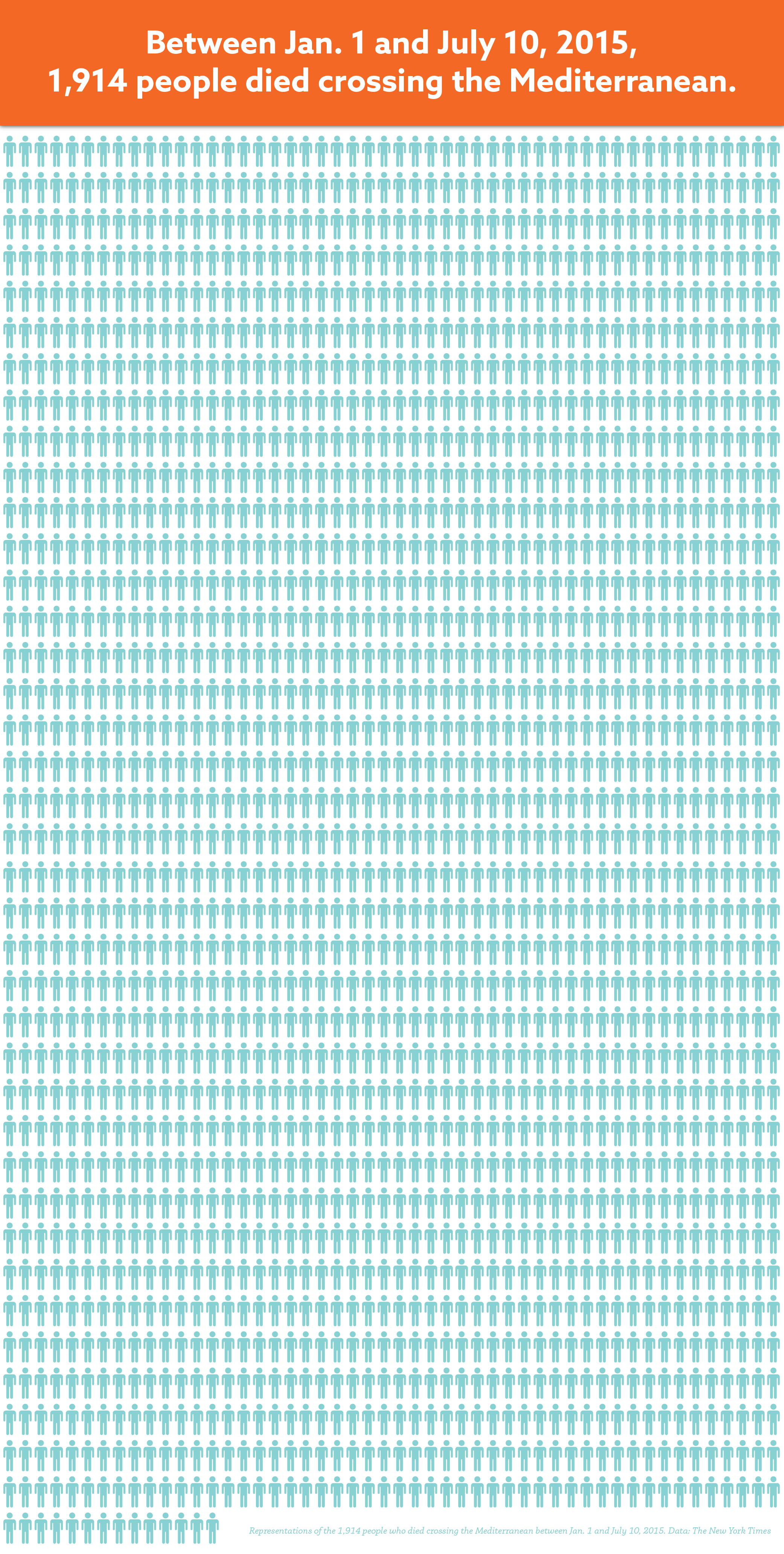
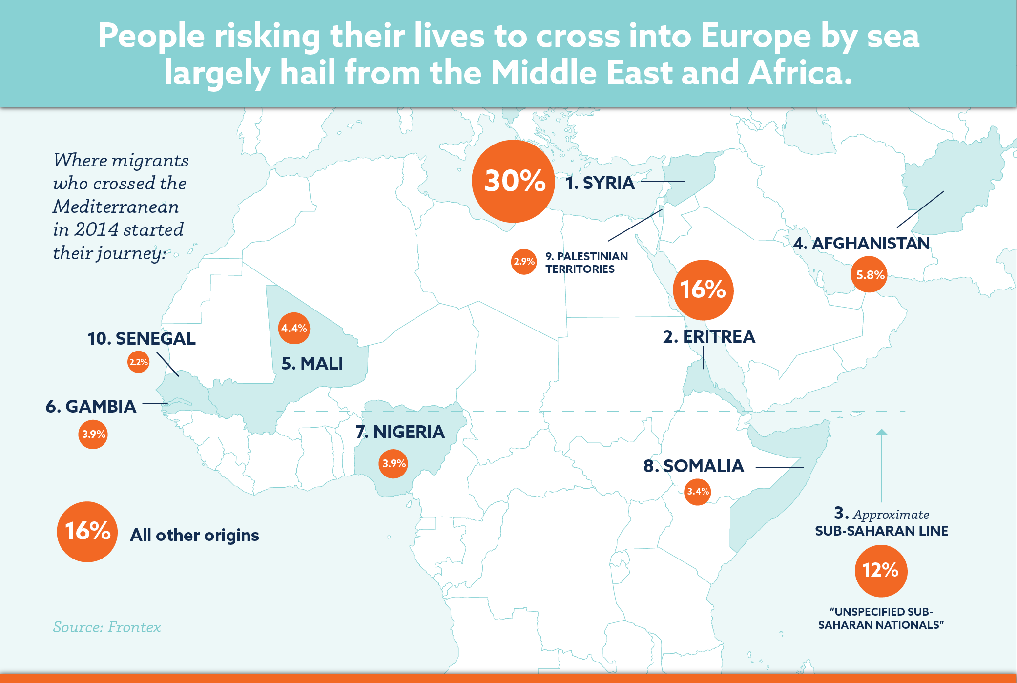
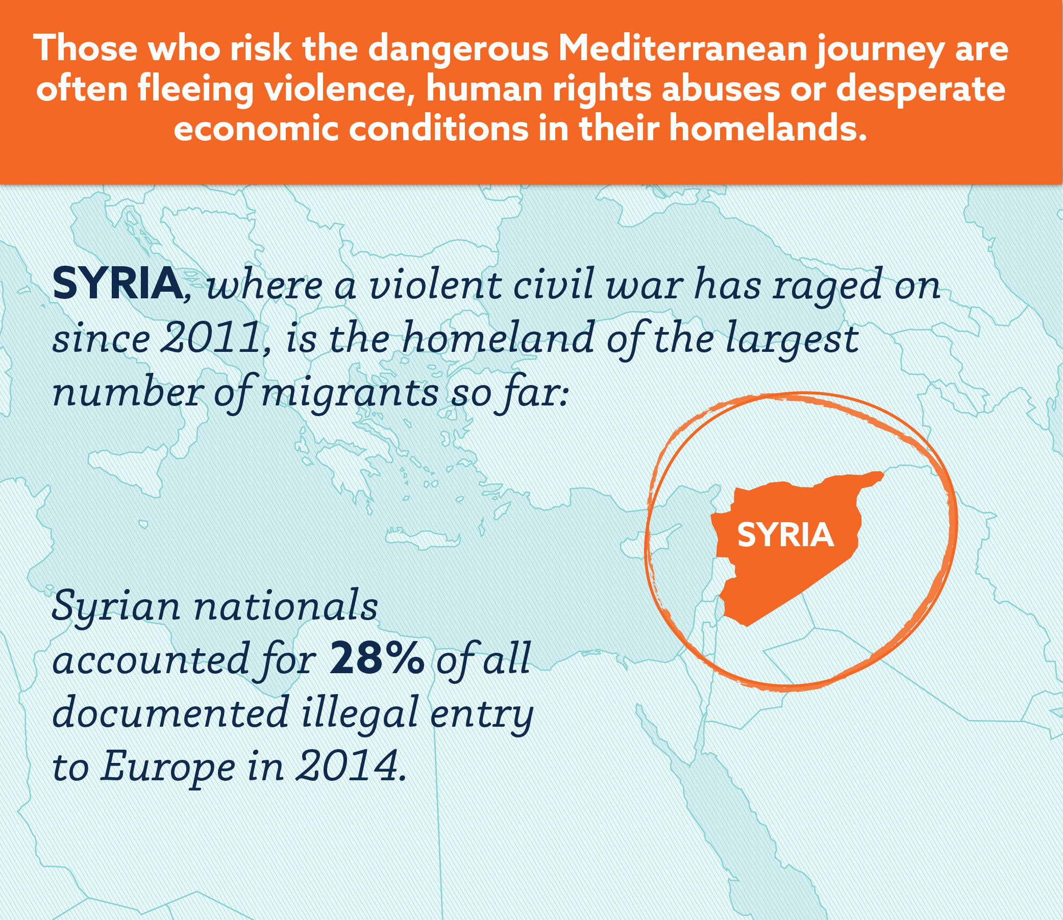
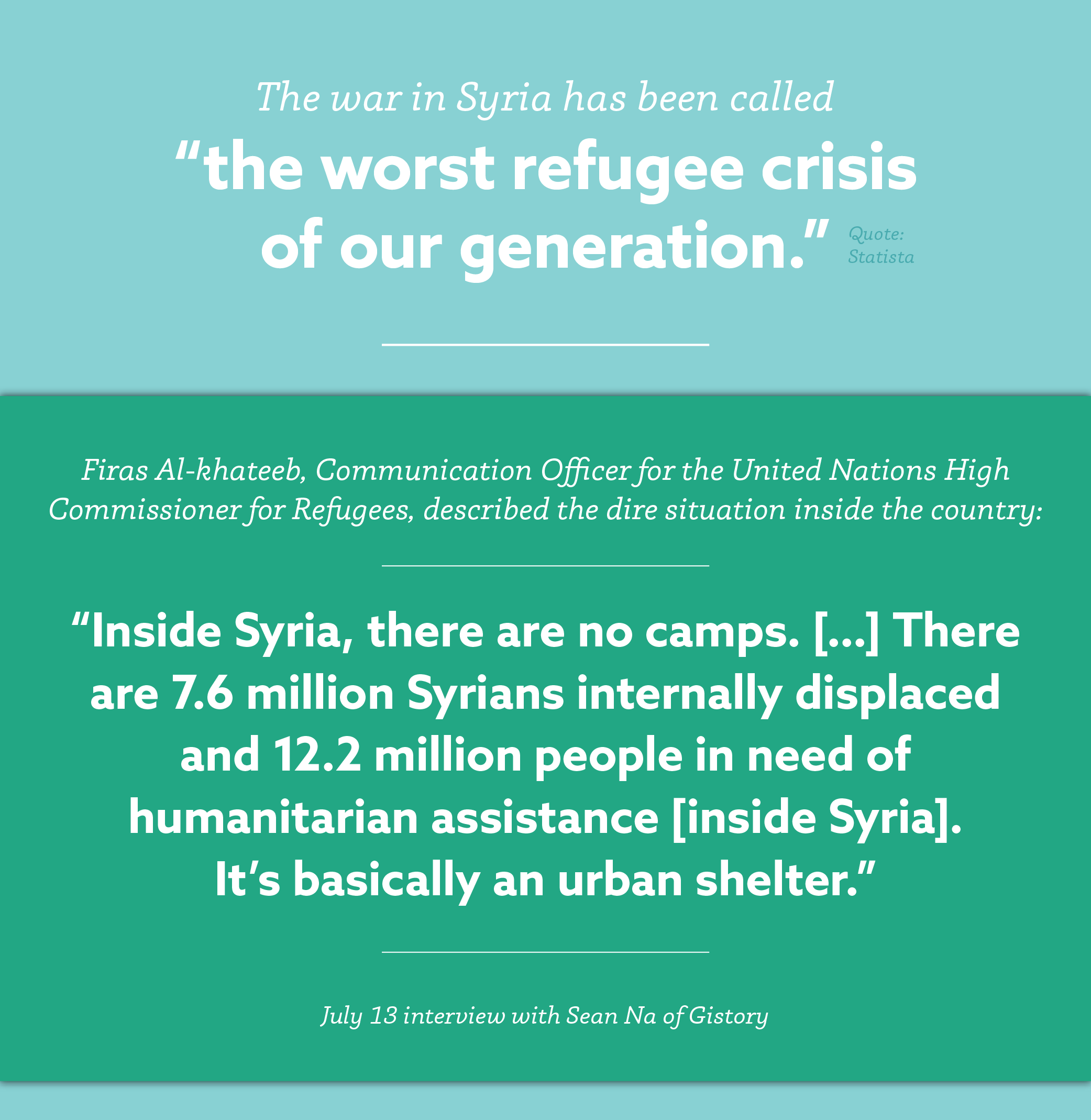
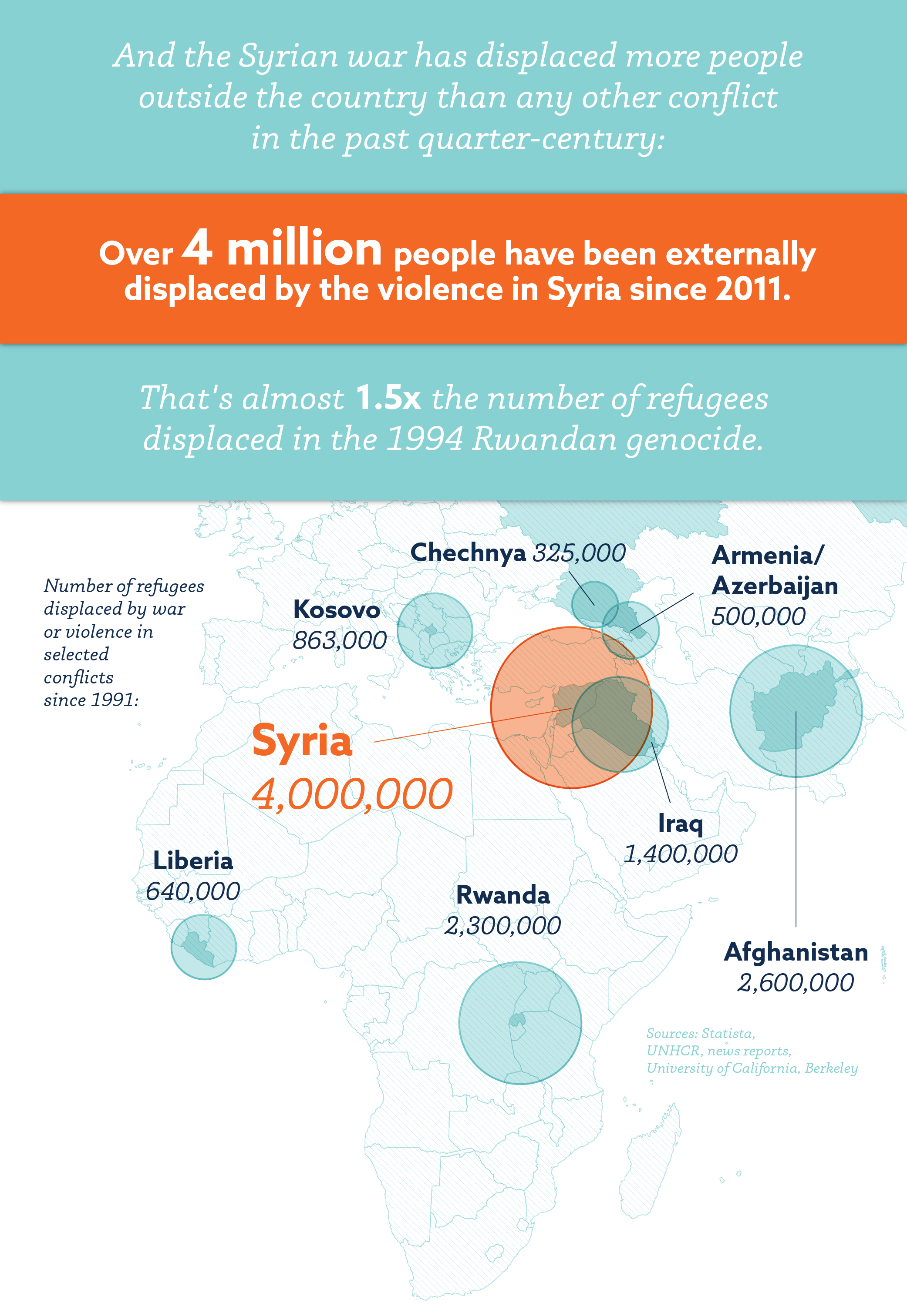
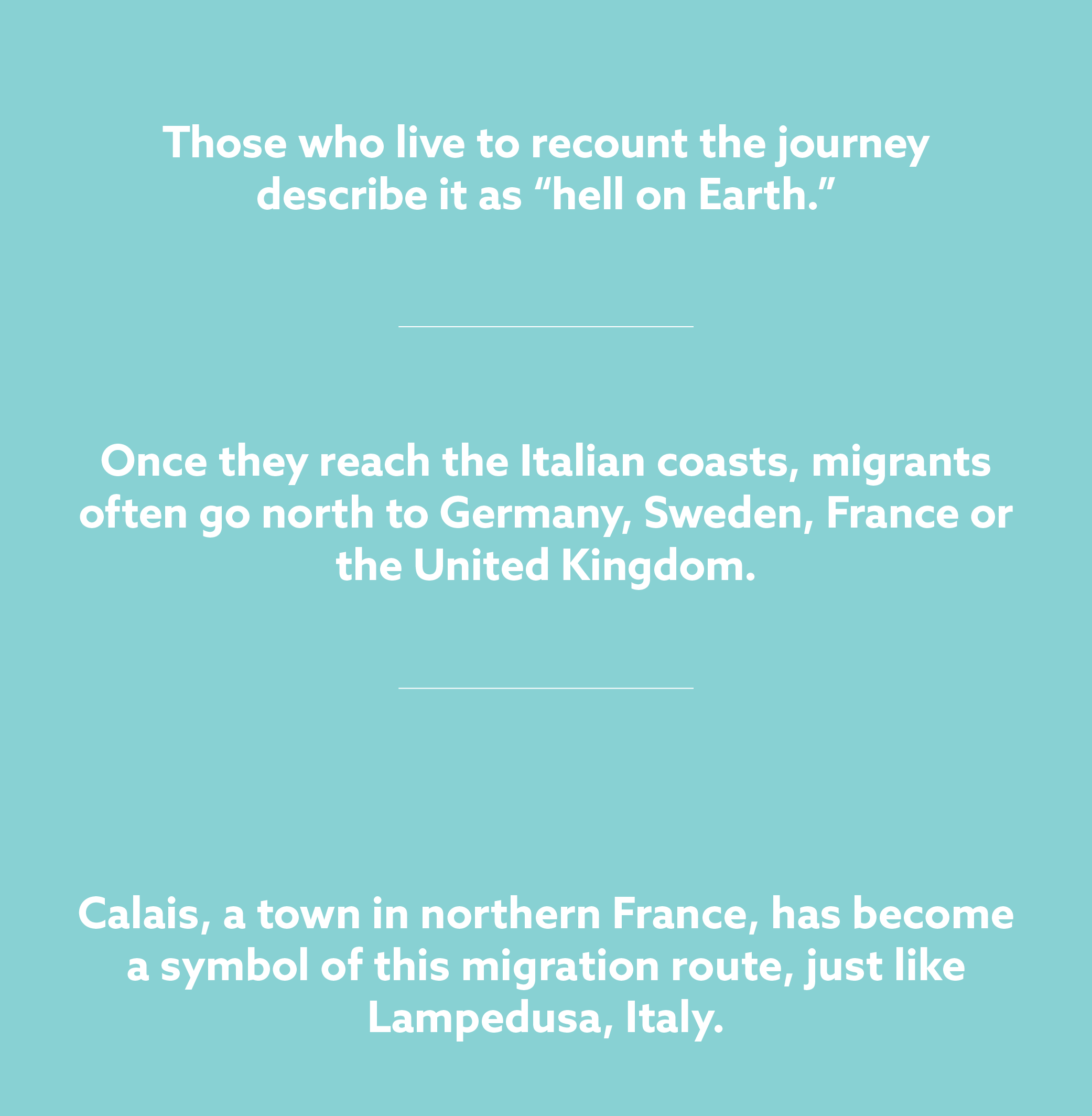
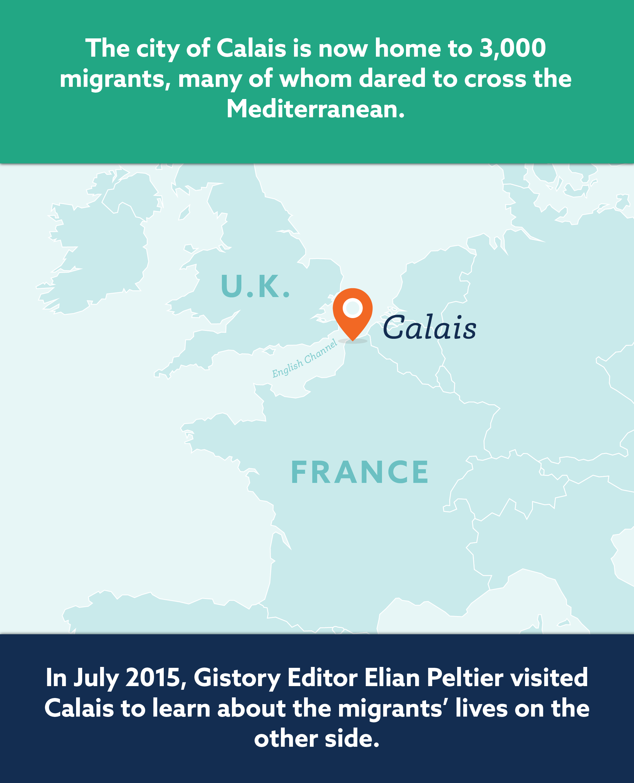
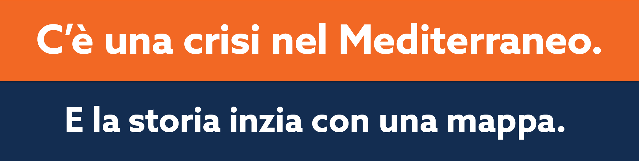
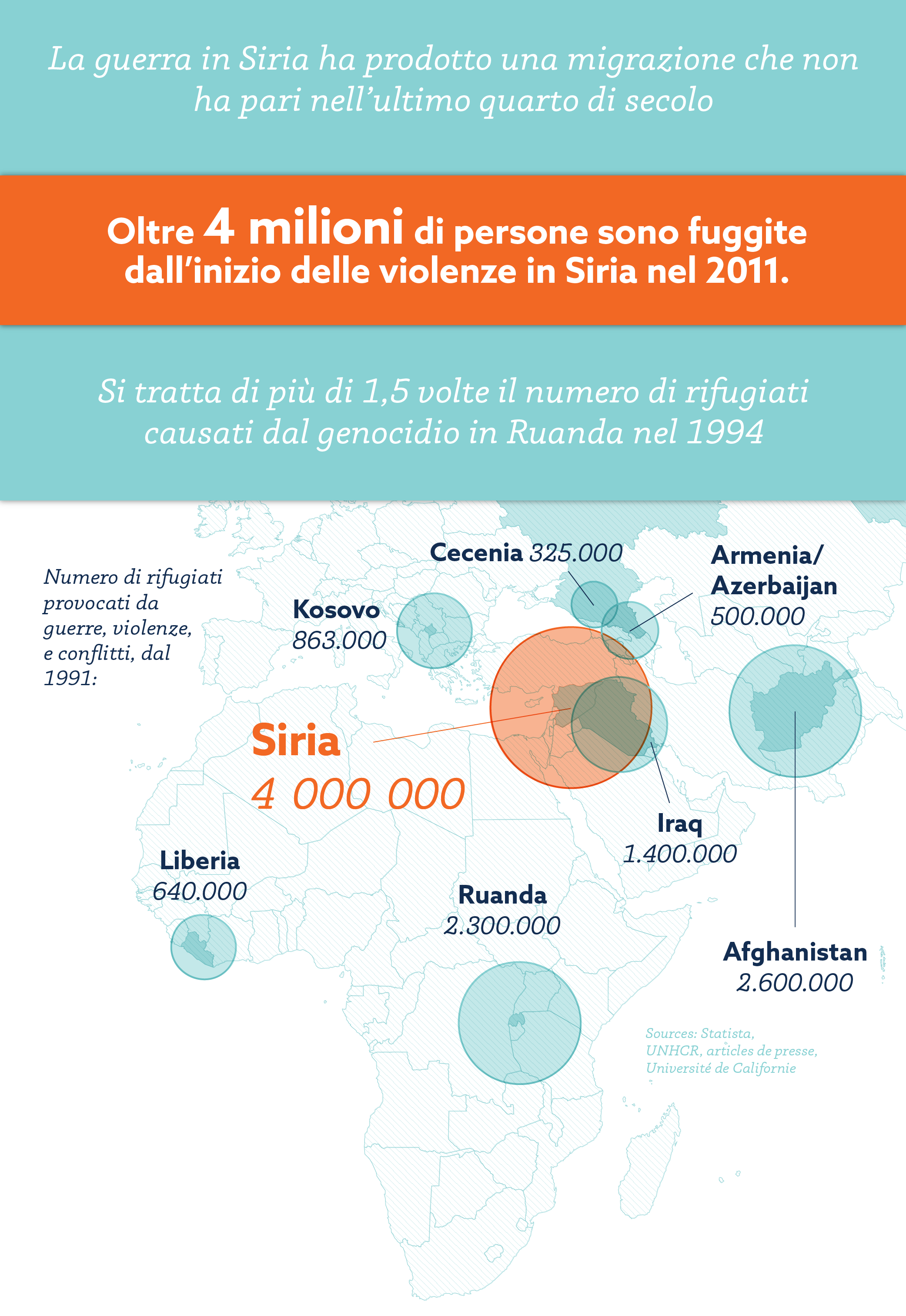
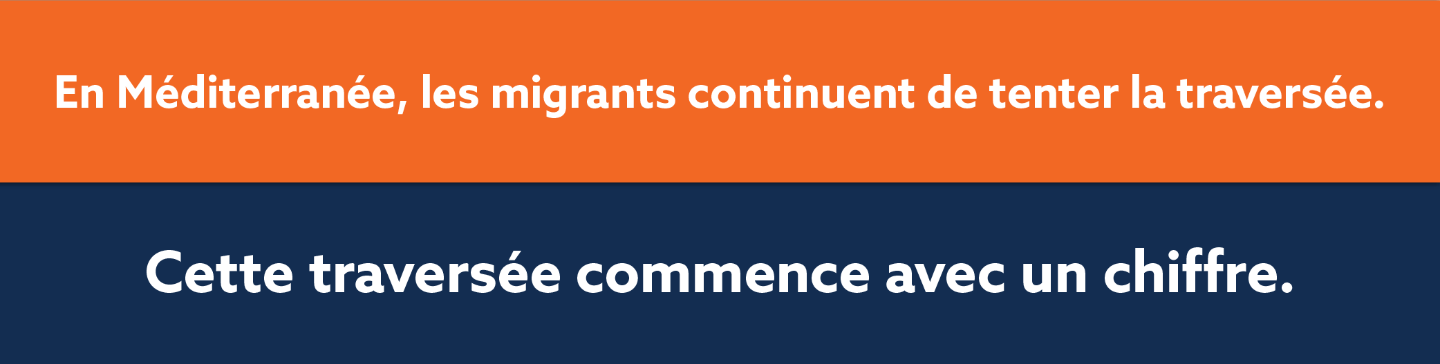
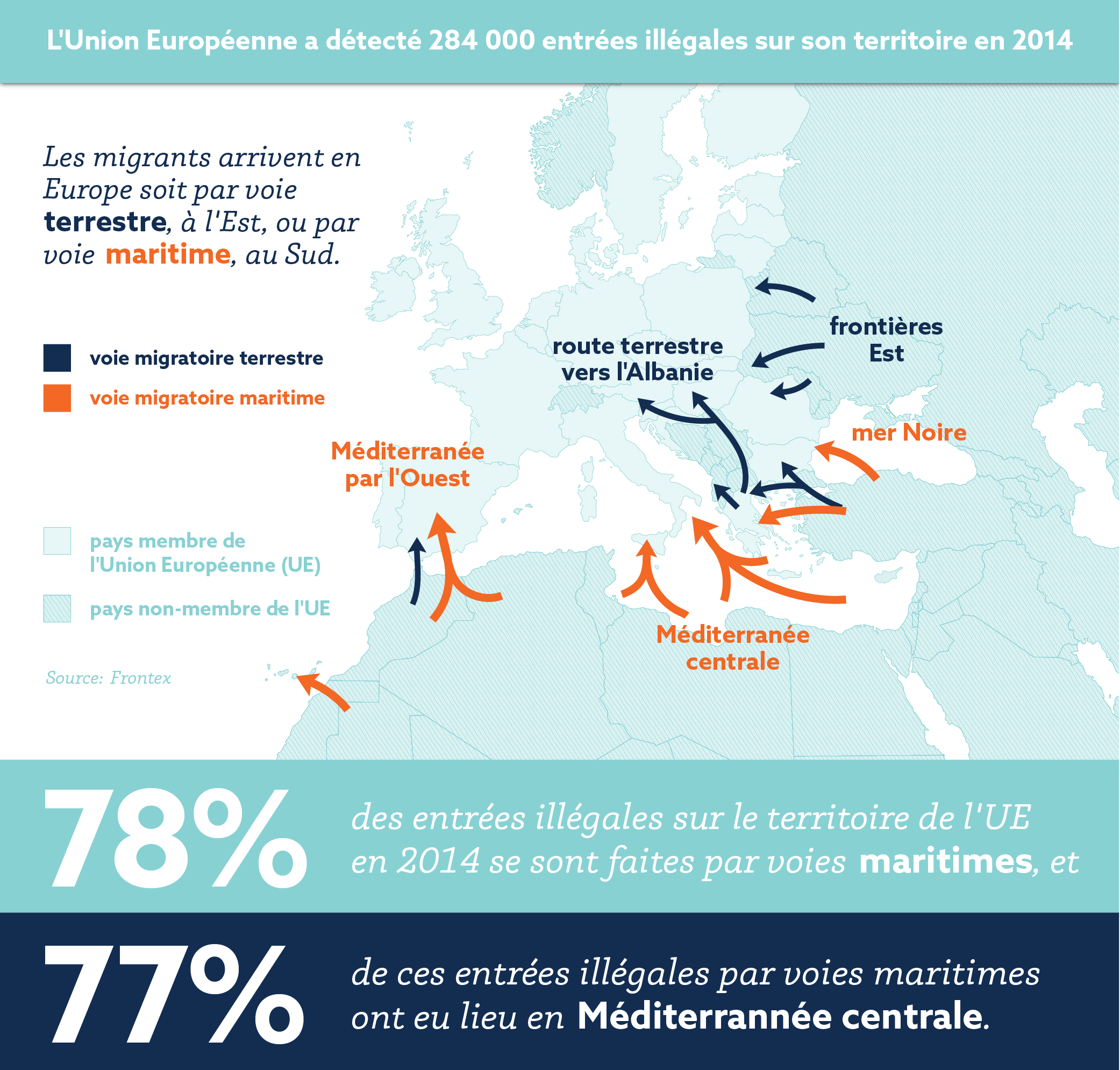
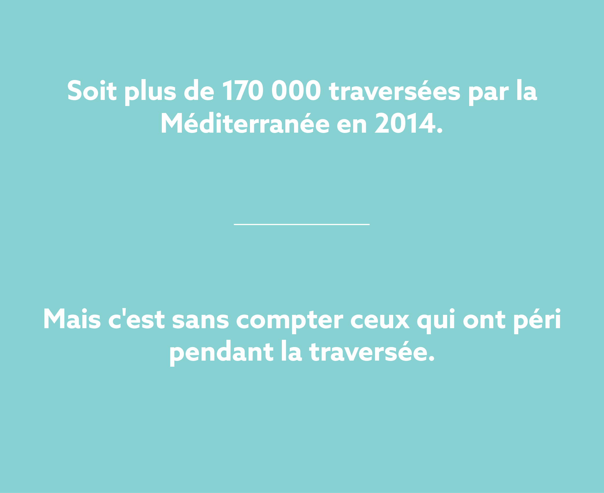
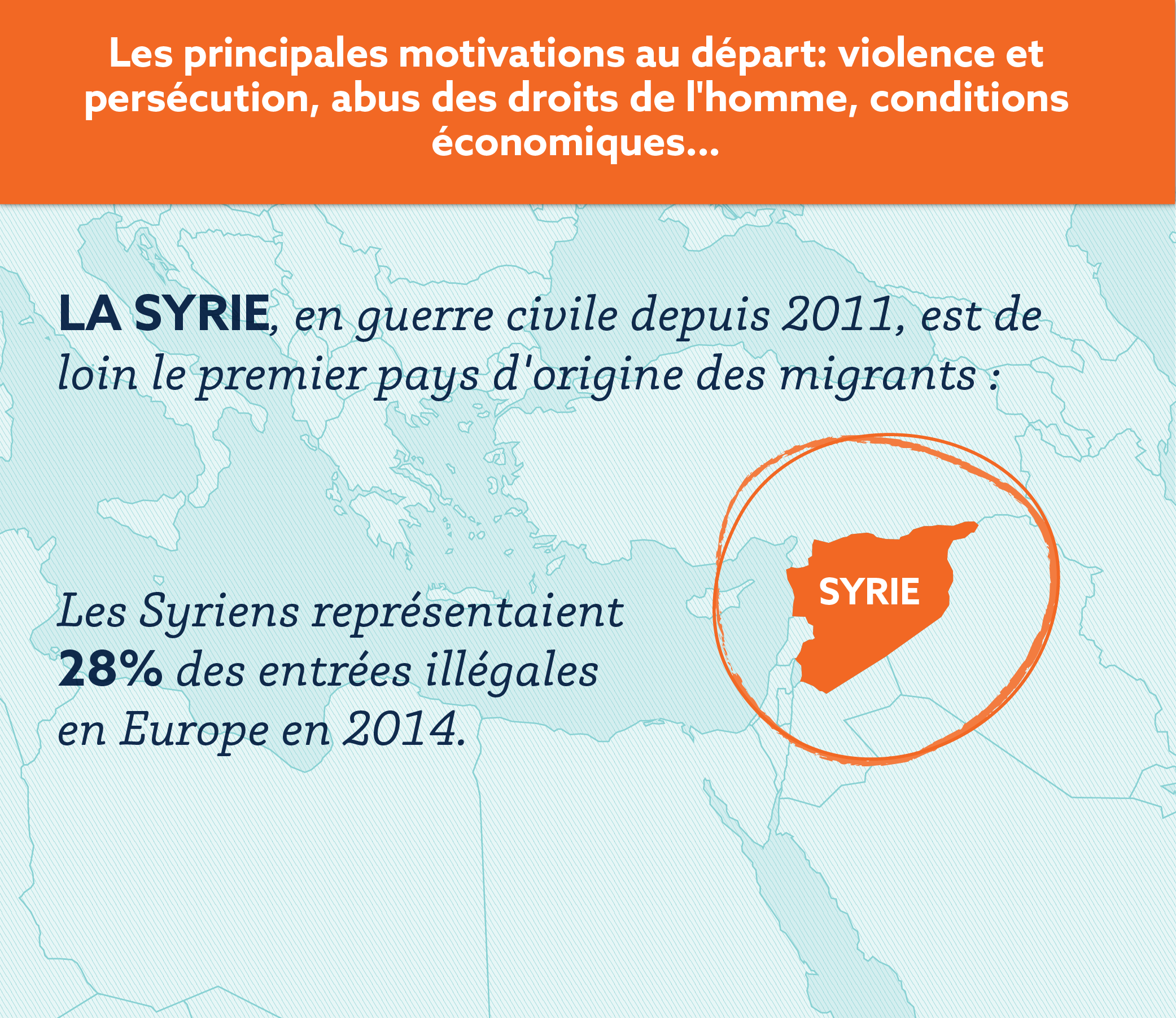
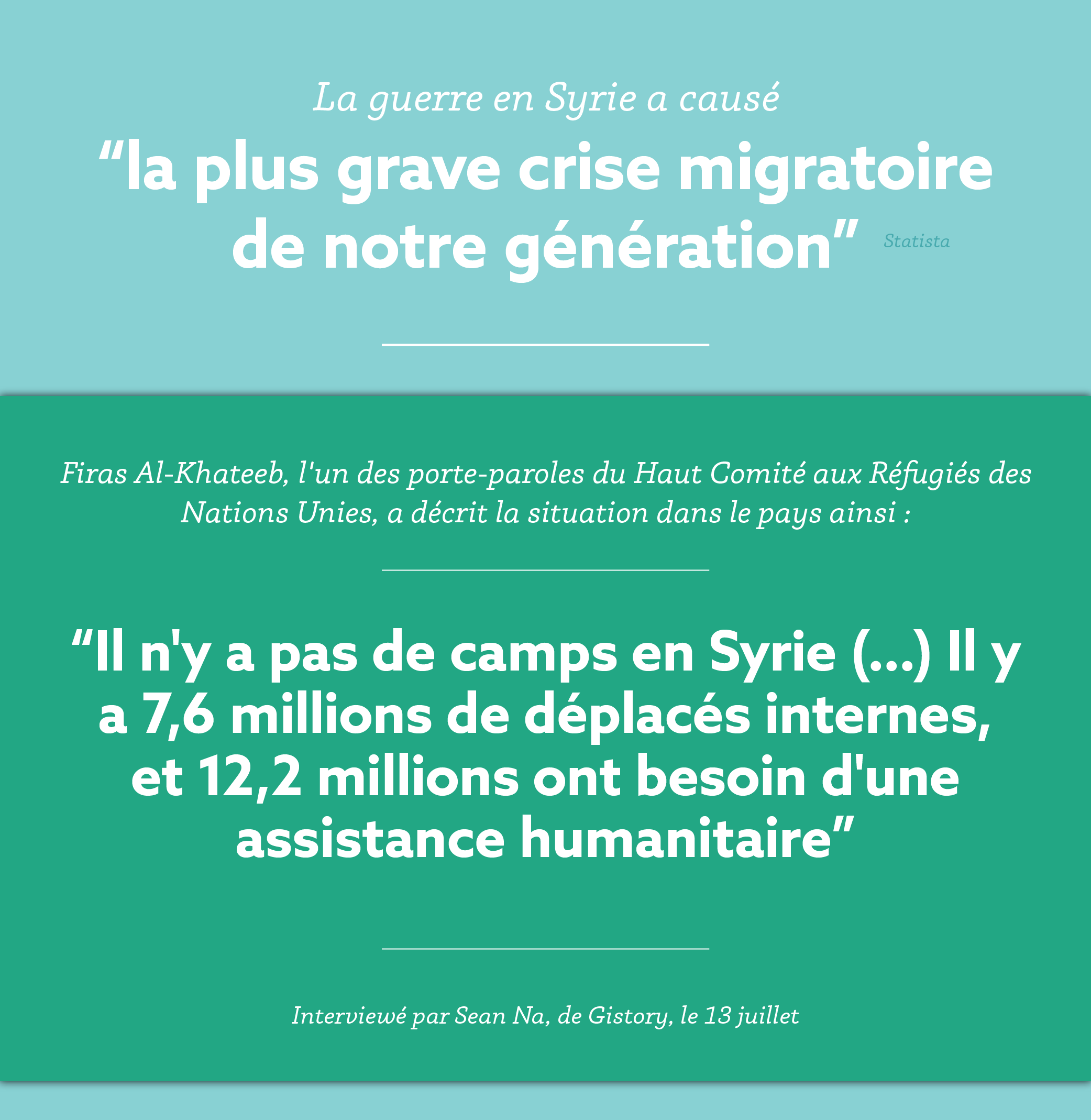
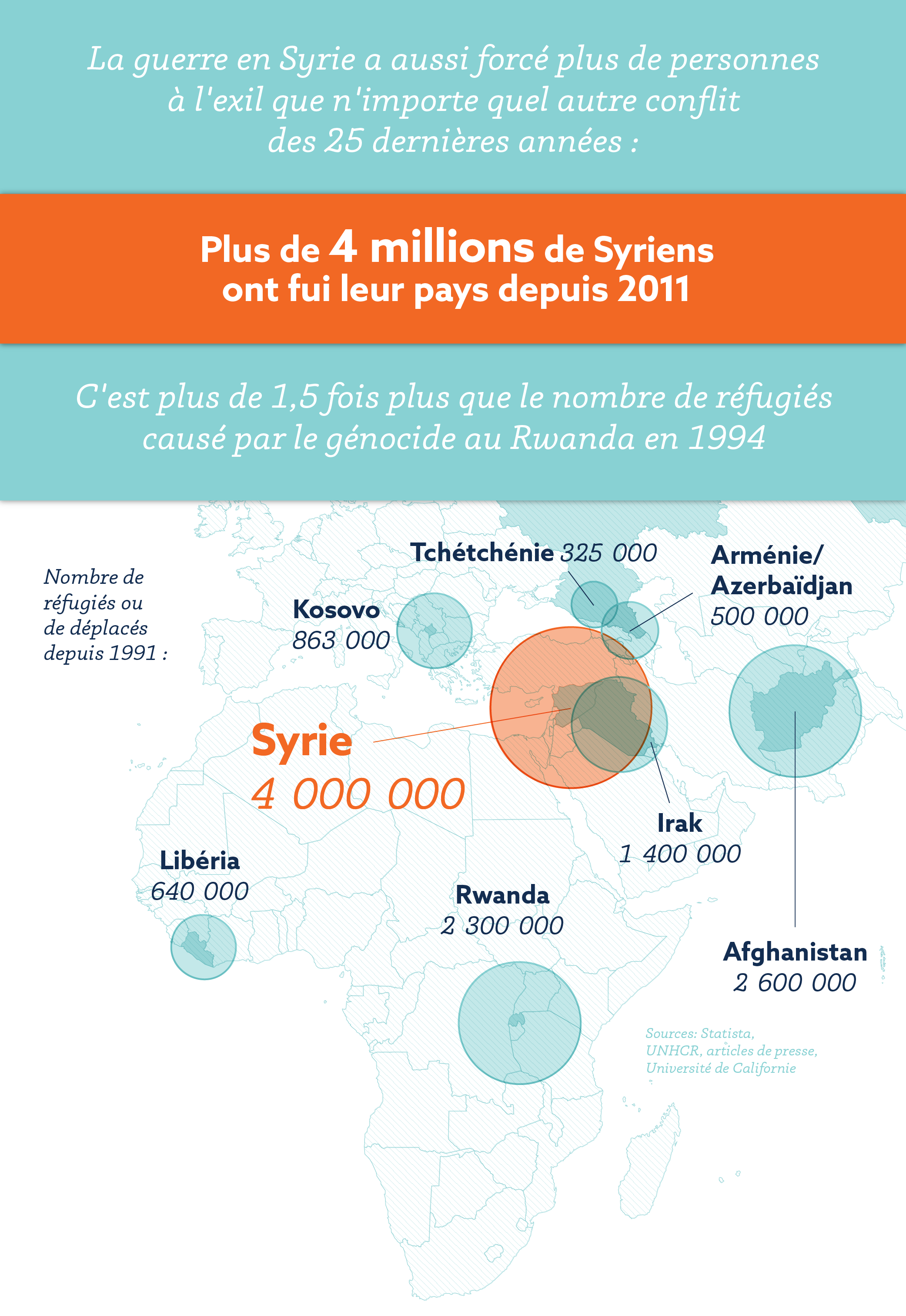
One of the most exciting projects I did at Gistory was create this visual article covering the ongoing influx of refugees across the Mediterranean into Europe. Part one covers how and why people are fleeing to Europe; part two covers the legal landscape and political response within the EU.
In addition to the original English, the piece was translated into French, Italian, Spanish, and Polish for a total of five final published versions.
Languages are great.
Maps are great.
Free and open data is great.
Dysfunctional, discriminatory policies that cost thousands of lives are not. I hate that my opportunity to create only came out of the vast misinformation and lack of information surrounding a humanitarian crisis that affects the entire world. International politics. And the lives of thousands of families and individuals.